 AW | 2019 01 21 12:53 | AIRLINES
 La aerolínea irlandesa Aer Lingus incorpora nueva imagen corporativa
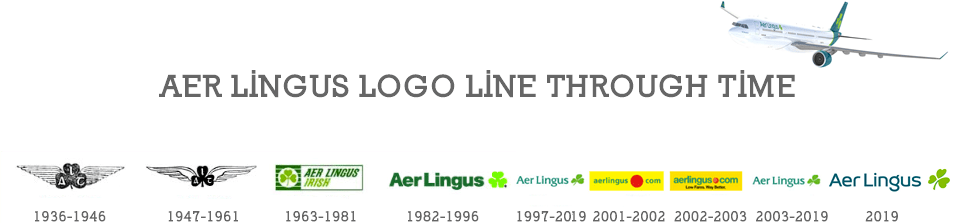
Aer Lingus ha renovado su imagen o librea en una presentación pública bajo el lema «Flies Smart», iniciando así la actualización de su marca en 2019, que se produce después de veinte años de su último cambio de marca importante. «La reimaginación de la marca Aer Lingus refleja a Irlanda en 2019. Una sociedad abierta, progresiva, liberal, con visión de futuro y dinámica, una Irlanda orgullosamente europea y que se ha convertido en el destino elegido para la inversión interna», expresaron desde la compañía irlandesa.
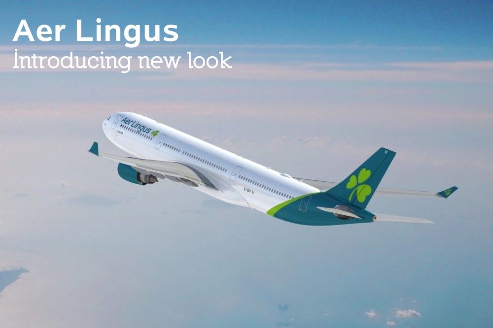
Durante más de 20 años, Aer Lingus ha volado con orgullo una flota de aviones con una librea totalmente verde, rindiendo homenaje a las raíces irlandesas de la aerolínea. Esto cambió el viernes cuando la aerolínea anunció su nueva imagen de marca y librea. Ahora oficialmente parte del club de librea de Eurowhite, la aerolínea ha rediseñado completamente su imagen. Lo que una vez fue una de las libreas más notables de volar el cielo es ahora un diseño completamente blanco con una cola pintada.
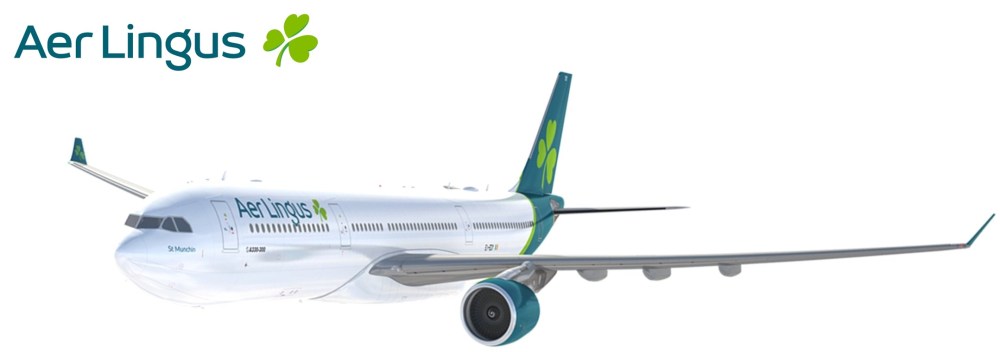
Aer Lingus es la segunda aerolínea del Grupo de Aerolíneas Internacionales (IAG) en anunciar una actualización de la marca en los últimos 10 años después de que Iberia cambiara su nombre en 2013, y también se transformó en una imagen de Eurowhite en su aeronave. A diferencia de cuando Lufthansa retiró su icónica grúa amarilla, Aer Lingus no ha eliminado el trébol verde de sus aviones. Cada aeronave Aer Lingus continuará volando con orgullo el símbolo icónico. El Airbus A330 contará con ocho tréboles que incluyen dos en la cola, dos cerca de los títulos de las aerolíneas, dos en las puertas 1L y 2L, y dos en cada winglet.
Además de mantener el trébol en su forma tradicional, hay otro homenaje a las raíces irlandesas de la aerolínea en las palabras «Aer Lingus» pintadas en la diapositiva del avión. Muchos de los que lean Celtic reconocerán que la «g» en Aer Lingus es el mismo estilo que se encuentra en el alfabeto celta.
Si bien cambiar una librea tan icónica puede generar reacciones violentas de los fanáticos leales de las aerolíneas, a largo plazo tiene sentido para Aer Lingus y se alinea con sus objetivos estratégicos. La aerolínea se ha alejado de ser una aerolínea irlandesa que vuela internacionalmente a una aerolínea internacional que se enfoca en conectar a los pasajeros a través de Irlanda. Solo este año, la aerolínea espera que el 50 por ciento de los pasajeros se conecten a través del creciente centro de Dublín de la aerolínea.
Además de la nueva identidad de marca y la librea, Aer Lingus también presentará un nuevo uniforme a finales de este año y dará la bienvenida a los nuevos Airbus A321LR a su creciente flota.
Marketing en Librea
Antes de presentar la nueva imagen en un evento en el Aer Lingus ‘Hangar 6 en Dublín, el operador pasó 12 meses escuchando los comentarios de los empleados y clientes en su centro y destinos en todo el mundo para ver qué funciona y qué no. Se consideraron más de 50 diseños diferentes de tréboles antes de elegir el actual.
Una portavoz de la aerolínea afirmó que su librea actual mostraba a los invitados internacionales que Aer Lingus era una aerolínea que lo llevaría a Irlanda, mientras que la nueva librea muestra una aerolínea que puede usar para conectarse, la nueva estrategia comercial de la aerolínea.
El trébol continuará volando, pero se ha rediseñado para representar los valores de la aerolínea. Según el transportista, la inclinación simboliza el dinamismo y la velocidad, mientras que el vástago mantiene el trébol reconocible y fuerte. Las hojas también tienen forma de corazones que reflejan la calidez y hospitalidad de la marca Aer Lingus.
Si bien el fuselaje de la aeronave ya no será verde, la nueva imagen requiere que los motores se pinten de nuevo verde azulado para dar color a la aeronave. El mismo verde azulado está pintado en el verde azulado, así como el verde claro del trébol.
Al explicar por qué Aer Lingus se está moviendo hacia una imagen más simple, la aerolínea observó que demasiado color y texto grande en una aeronave representa una aerolínea de bajo costo, como la imagen que se ve en Wizzair y Spirit Airlines.
Los esquemas de pintura más simples y el texto más pequeño en la aeronave, por otro lado, significan portadores de servicio completo como Singapore Airlines y Lufthansa. El blanco también se usa para significar fuerza, ya que es un color limpio y nítido en un avión y eso es lo que Aer Lingus dice que busca, una imagen de fuerza.
Si bien su aeronave obviamente puede cruzar el Atlántico sin problemas y lo hace a diario, Aer Lingus pretende utilizar la librea blanca para transmitir una mayor sensación de fuerza a su aeronave. Una apariencia majestuosa y fuerte en comparación con una librea algo de juguete que se ve en muchas aerolíneas de bajo costo y el tema de otras aerolíneas de IAG, incluyendo Iberia y la aerolínea de bajo costo Nevel Airlines. Aer Lingus cree que su nueva imagen refleja la moderna aerolínea internacional que ocupa el espacio de valor en el que se está transformando.
El primer vuelo del avión insignia de larga distancia del avión, el Airbus A330-300, pintado en la nueva librea realizó su primer vuelo el viernes después de su presentación la noche anterior. El avión voló en una de las rutas más populares de la aerolínea desde Dublín a Nueva York como EI 105, llegando al Aeropuerto Internacional JFK y estacionando en la Terminal 5 por la tarde.
El Aeropuerto JFK es un receptor frecuente de nuevas marcas de aerolíneas, que recibió el primer vuelo de Air Italy recientemente renombrado en junio y el primer vuelo de un Lufthansa rebautizado en febrero. Aer Lingus ha estado sirviendo a Nueva York durante décadas a través del aeropuerto, gracias a la gran diáspora irlandesa que existe en la zona, lo que lo convierte en un receptor apropiado para el primer vuelo en la nueva marca.
Expansión de mercado
Aer Lingus tiene ambiciosos planes de crecimiento. La aerolínea tiene la cabeza recta y no es delirante sobre su posición en el mercado. Como aerolínea Skytrax de cuatro estrellas, no quiere convertirse en una aerolínea de cinco estrellas, tampoco quiere caer en las filas de una aerolínea de bajo costo. La aerolínea está enfocada de lleno en el centro de la carretera, enfocándose en combinar la solidez de un operador de servicio completo con el atractivo de un operador de valor a través de los precios ofrecidos.
Imagen Uniformes
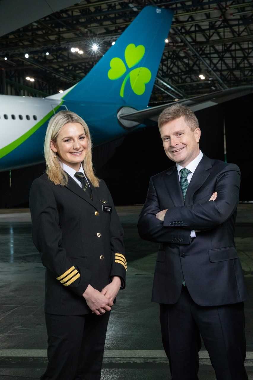
Además de la nueva imagen, la aerolínea también planea introducir nuevos uniformes este año diseñados por Louise Kennedy, la misma diseñadora del uniforme actual. El A321neo LR también se agregará a la flota de la aerolínea este año con la nueva imagen. Actualmente, Aer Lingus tiene dos aviones que vuelan con la nueva librea y espera que toda la flota sea repintada para 2022. Las dos aeronaves que debutan con la nueva librea son St. Munchin, un Airbus A330-300 con registro EI-EDY y St. Schira. Un Airbus A320 con registro EI-CVA.
Este año será interesante para los clientes de aerolíneas, ya que otras grandes compañías como Singapore Airlines están preparadas para lanzar nuevas imágenes de marca.
Introducing new look of Aer Lingus
 The Irish airline Aer Lingus incorporates a new corporate image
Aer Lingus has renewed its image or livery in a public presentation under the slogan «Flies Smart», thus initiating the update of its brand in 2019, which takes place after twenty years of its last important brand change. «The reimagination of the Aer Lingus brand reflects Ireland in 2019. An open, progressive, liberal, forward-looking and dynamic society, a proudly European Ireland that has become the chosen destination for internal investment», they said. the Irish company.
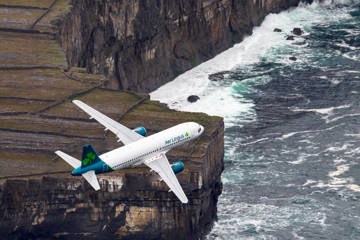
For more than 20 years, Aer Lingus has proudly flown a fleet of airplanes with a totally green livery, paying tribute to the Irish roots of the airline. This changed on Friday when the airline announced its new brand image and livery. Now officially part of the Eurowhite livery club, the airline has completely redesigned its image. What was once one of the most remarkable liveries of flying the sky is now a completely white design with a painted tail.
Aer Lingus is the second airline of the International Airlines Group (IAG) to announce an update of the brand in the last 10 years after Iberia changed its name in 2013, and it also became an image of Eurowhite on its aircraft. Unlike when Lufthansa withdrew its iconic yellow crane, Aer Lingus has not eliminated the green clover from its aircraft. Each Aer Lingus aircraft will continue to fly with pride the iconic symbol. The Airbus A330 will have eight clovers that include two in the queue, two near the airline titles, two at the 1L and 2L gates, and two at each winglet.
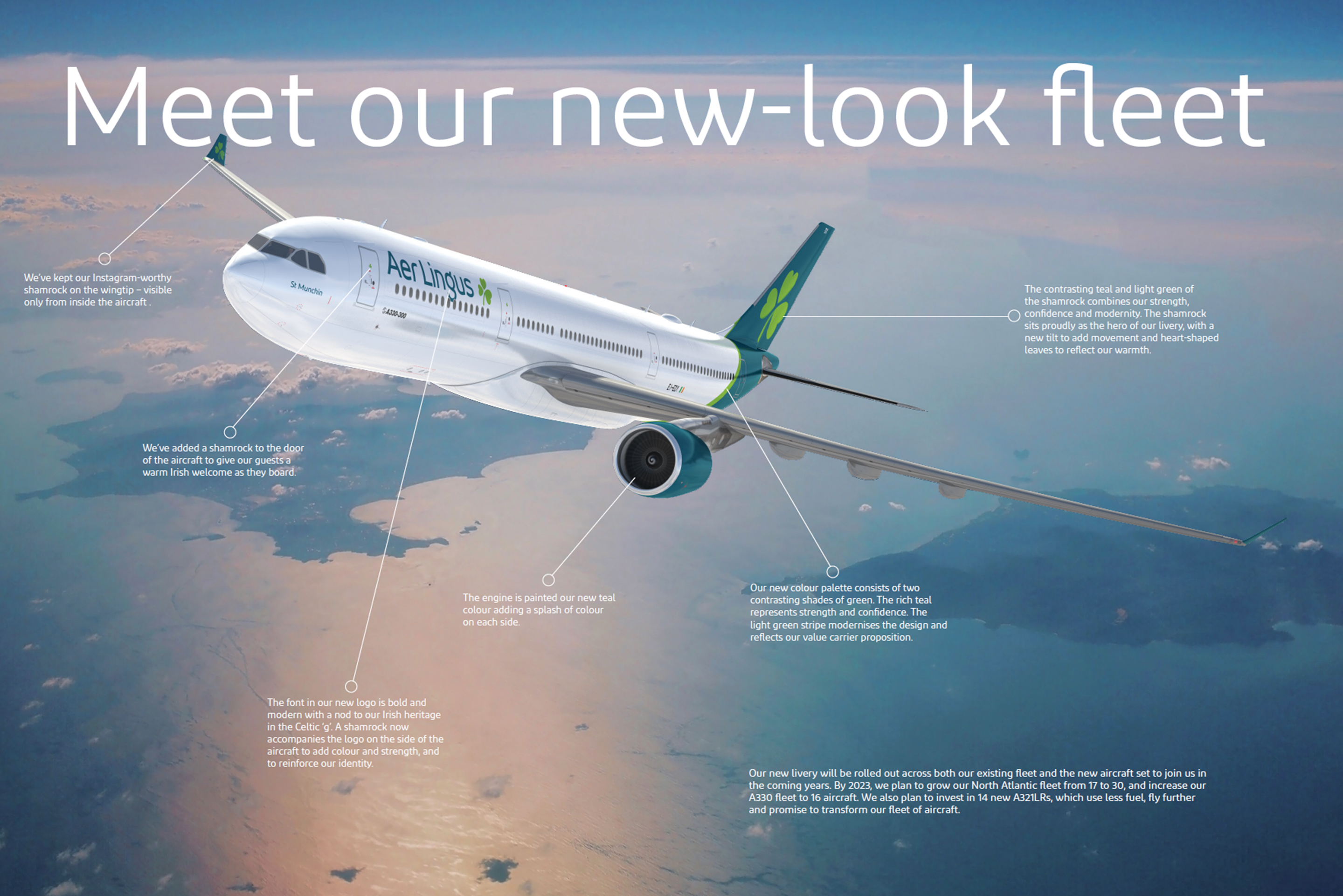
In addition to keeping the clover in its traditional form, there is another tribute to the Irish roots of the airline in the words «Aer Lingus» painted on the plane’s slide. Many of those who read Celtic will recognize that the «g» in Aer Lingus is the same style found in the Celtic alphabet.
While changing such an iconic livery can generate violent reactions from loyal fans of airlines, in the long term it makes sense for Aer Lingus and aligns with its strategic objectives. The airline has moved away from being an Irish airline that flies internationally to an international airline that focuses on connecting passengers through Ireland. This year alone, the airline expects 50 percent of passengers to connect through the airline’s growing Dublin hub.
In addition to the new brand identity and livery, Aer Lingus will also present a new uniform later this year and will welcome the new Airbus A321LR to its growing fleet.
Marketing in Librea
Before presenting the new image at an event at the Aer Lingus’ Hangar 6 in Dublin, the operator spent 12 months listening to the comments of employees and customers at its center and destinations around the world to see what works and what does not. We considered more than 50 different designs of clubs before choosing the current one.
A spokeswoman for the airline said its current livery showed international guests that Aer Lingus was an airline that would take it to Ireland, while the new livery shows an airline that can be used to connect, the airline’s new commercial strategy.
The clover will continue to fly, but it has been redesigned to represent the values of the airline. According to the transporter, the inclination symbolizes dynamism and speed, while the stem keeps the clover recognizable and strong. The leaves also have the shape of hearts that reflect the warmth and hospitality of the Aer Lingus brand.
While the fuselage of the aircraft will no longer be green, the new image requires the engines to be painted a new bluish green to color the aircraft. The same bluish green is painted in bluish green, as well as the light green of the clover.
In explaining why Aer Lingus is moving towards a simpler image, the airline noted that too much color and large text on an aircraft represents a low-cost airline, such as the image seen on Wizzair and Spirit Airlines.
The simplest paint schemes and the smallest text on the aircraft, on the other hand, mean full-service carriers such as Singapore Airlines and Lufthansa. The white one also is used to mean physically buscar, because he is a clean and clear color in an airplane and that is what Aer Lingus says he is looking for, an image of strength.
While his aircraft obviously can cross the Atlantic without problems and does so on a daily basis, Aer Lingus intends to use the white livery to convey a greater sense of strength to its aircraft. A majestic and strong appearance compared to a somewhat toy livery that is seen in many low-cost airlines and the subject of other IAG airlines, including Iberia and the low-cost airline Nevel Airlines. Aer Lingus believes that its new image reflects the modern international airline that occupies the value space in which it is being transformed.
The first flight of the plane’s long-range flagship aircraft, the Airbus A330-300, painted in the new livery made its first flight on Friday after its presentation the night before. The plane flew on one of the airline’s most popular routes from Dublin to New York as EI 105, arriving at JFK International Airport and parking in Terminal 5 in the afternoon.
JFK Airport is a frequent recipient of new airline brands, which received the first Air Italy flight recently renamed in June and the first flight of a Lufthansa renamed in February. Aer Lingus has been serving New York for decades through the airport, thanks to the large Irish diaspora that exists in the area, which makes it an appropriate receiver for the first flight in the new brand.
Market expansion
Aer Lingus has ambitious growth plans. The airline has a straight head and is not delirious about its position in the market. As a four-star Skytrax airline, it does not want to become a five-star airline, nor does it want to fall into the ranks of a low-cost airline. The airline is focused squarely on the center of the road, focusing on combining the strength of a full service operator with the attractiveness of a value operator through the prices offered.
Uniform Image
In addition to the new image, the airline also plans to introduce new uniforms this year designed by Louise Kennedy, the same designer of the current uniform. The A321neo LR will also be added to the airline’s fleet this year with the new image. Currently, Aer Lingus has two aircraft that fly with the new livery and expects the entire fleet to be repainted by 2022. The two aircraft that debuted with the new livery are St. Munchin, an Airbus A330-300 with registration EI-EDY and St Schira. An Airbus A320 with EI-CVA registration.
This year will be interesting for airline customers, as other large companies such as Singapore Airlines are ready to launch new brand images. A \ W
Ξ A I R G W A Y S Ξ
SOURCE: Airgways.com
DBk: Aerlingus.com / Airlinegeeks.com / Airgways.com
AW-POST: 201901211253AR
A\W A I R G W A Y S ®
 AW | 2019 01 21 22:28 | AIRLINES
 AW | 2019 01 21 12:03 | AIRLINES / INDUSTRY
 PRESENTACIÓN PÚBLICA DEL PRIMER VUELO DEL BOEING 727-100
 VUELO INAUGURAL DEL BOEING 727-200
 Last commercial flight of the Boeing 727
 Last commercial passenger flight of the Boeing 727
 Withdrawal service from 727
 ROLL OUT OF THE FIRST BOEING 727 IN 1963
 Storm Harper cancels more 4,500 flights
 AW | 2019 01 21 10:39 | AIRLINES ROUTES / GOVERNMENT
 Germany withdraws permission to Mahan Air
 AW | 2019 01 21 10:20 | AIRLINES / INDUSTRY


